

Design Systems for Apps

When every screen looks different and every developer makes UI decisions from scratch, every update becomes a guessing game.
Design Systems That Scale with Your App
An app design system brings order: shared components, consistent tokens, and clear rules that keep design and development in sync – today and two years from now. Scalability starts not in code, but in the system.
The essentials of Design Systems for Apps
- We build app design systems from shared components, tokens and clear rules that keep design and development in sync.
- Colours, spacing, radii and typography become named tokens that components reference exclusively – so dark mode or a rebrand becomes a configuration change rather than a find-and-replace operation.
- We connect Figma and the code repository so design and code speak the same names and a design decision is made exactly once.
- A complete component library – buttons, inputs, cards, navigation, modals – is defined in all its states: default, hover, active, disabled, error.
- We document every component with usage guidelines and do/don't examples so new team members are productive immediately and consistency turns into speed.




Real App Successes
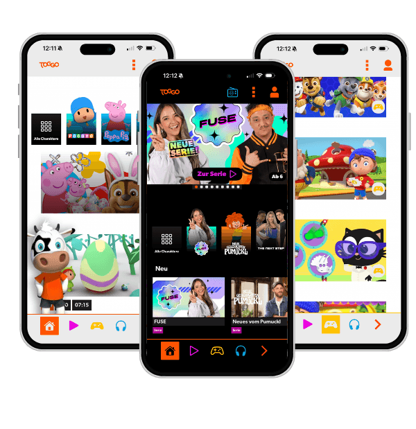
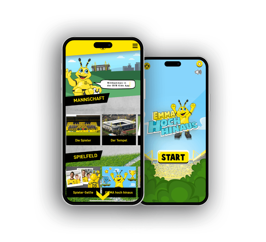

- Every developer builds their own UI components – the result is an inconsistent patchwork interface.
- Every small design change needs to be manually updated in twenty places.
- New team members need weeks to understand how the app is structured and what components exist.
Component Library
We build a complete library of reusable UI components – buttons, inputs, cards, navigation, modals, and more. Every component is defined in all its states: default, hover, active, disabled, error. Developers build from these building blocks instead of re-implementing the same elements over and over.
Design Tokens
Colours, type scales, spacing, and radii are defined as tokens – named values shared between design and code. When you change your primary colour, it happens in one place and propagates throughout the entire app. Tokens are the foundation on which consistent design scales.
Documentation
A design system is only as good as its documentation. We document every component with usage guidelines, do/don't examples, and technical specifications – so new team members can be productive immediately and no one has to make gut-feel decisions.
Figma and Code Sync
We keep design tokens in sync between Figma and the code repository. Changes made in the design tool find their way into the implementation – without manual transcription errors. This prevents the most common drift between design and code in growing app projects.
Anatomy of an App Design System
A design system is not a folder full of components – it is a layered foundation. Skipping the base means building on sand.
Consistent Product
Every screen follows the same rules – regardless of who built it.
Documentation & Figma-Code Sync
Usage guidelines, examples, and the live connection between design and code.
Component Library
Reusable, tested UI building blocks that exclusively consume tokens.
Design Tokens
Named values for colours, spacing, radii, and typography as the single source of truth.
Each layer depends on the one below. Missing tokens → components drift apart. Missing components → documentation just describes chaos.
Without a System vs. With a Design System
The same everyday situations – two completely different experiences, depending on whether a design system is in place.
| Without a Design System | With a Design System | |
|---|---|---|
| UI change (e.g. primary colour) | Manual update in dozens of places | Change one token, everything follows |
| Building a new screen | Developer builds components from scratch | Assembled from existing building blocks |
| Onboarding new team members | Weeks to learn implicit conventions | Documentation shows components and rules directly |
| Dark mode / rebranding | Major project with unknown scope | Configuration change at token level |
| Consistency across all screens | Accidental – depends on who built it | Structurally guaranteed by components |
The difference does not show on the first screen; it shows on the fiftieth.
What matters for Design Systems for Apps
An app design system is built from tokens, not from a component library. Colours, spacing, radii, and typography become named values, and components reference only those. Only then does dark mode or a rebrand become a configuration change rather than a find-and-replace operation across a hundred files. Build components without a token layer underneath and you merely relocate the chaos.
What matters is that design and code speak the same names. If the designer says primary and the code hardcodes a hex colour, the two worlds drift apart the moment something changes. We connect the source of truth so that a design decision is made exactly once and rendered consistently everywhere.
A design system lives on discipline, not on completeness. It must be clear when an existing component is used and when a new one is justified, otherwise a shadow system of special cases grows alongside the real one. Good systems make the right path the easiest path instead of just posting rules nobody enforces.
And a system without documentation and examples is just a codebase with good intentions. New team members must be able to see, without asking, which components exist, what they are for, and how they behave. That is exactly what turns consistency into speed.
Single Source of Truth
A design system is the only reliable source for all UI decisions. Design and development work from the same foundation – eliminating the most common source of inconsistency in growing projects.
Faster Iteration
With a component library, developers build new screens from existing building blocks. This accelerates feature development significantly while simultaneously reducing quality issues.
Long-term Maintainability
Tokens and components make global changes manageable. Rebranding, dark mode, or new platforms become a calculable effort rather than a major project.
One system, every screen
With us you're always one step ahead technologically and tap directly into our extensive app development expertise. We take a close look at your app idea, identify key success factors and create tailor-made applications. Your visions and goals are at the heart of our joint project work.
Expert knowledge in app technologies
React Native, native iOS and Android development: we pick the stack to fit your project, not our preference.
Comprehensive user experience know-how
Intuitive operation and seamless interactions decide ratings and how long users stay in the app.
Proven track record
Published apps in the App Store and Play Store, from MVP to mature platform.
Versatile team
Concept, design, development and backend come together in one team that works without interface friction.
Long-term partnerships
We stay after launch and keep evolving your app with maintenance and updates.


Frequently asked questions
Your question isn't here? Ask us directly
When does a design system become worthwhile?
As soon as more than one person works on the app, or the app is meant to be developed long-term. The earlier the system is built, the less inconsistent legacy to unify later.
Does a design system slow development down?
Short-term, you invest time in building it. Medium-term, every new feature gets developed faster because components already exist. For growing apps, the investment pays off clearly.
Can a design system scale to multiple apps?
Yes – that is one of its greatest values. A well-structured system can be applied to multiple apps, platforms, or brands, ensuring consistent user experiences across product boundaries.
Last updated on
READY FOR YOUR APP THAT SETS NEW STANDARDS?


Related articles from our blog