

App UX/UI Design

Thoughtful UX/UI design determines whether users love your app or delete it in frustration.
App UX/UI Design That Users Love
We craft interfaces that are intuitive to navigate, carry your brand consistently, and guide users through their tasks efficiently – from first sketch to final pixel. Design is not the last step in our process; it is the starting point for all technical decisions.
The essentials of App UX/UI Design
- We craft app interfaces from first sketch to final pixel – intuitive to use and consistent with your brand.
- Every screen gets one clear primary action and everything else subordinates to it, because hierarchy is what makes usability possible in the first place.
- We design for the thumb and check designs early on a real phone rather than only in the finished build – with reachable tap targets and predictable gestures.
- We respect the different iOS and Android conventions and hold brand consistency through colour, typography and tone.
- We hand off designs cleanly with tokens, component descriptions and documented states, so developers never have to guess and the result matches the design.




Real App Successes
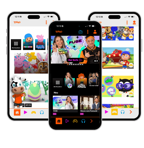
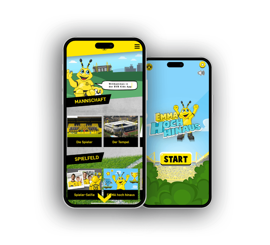

- Your app has all the features but users get lost and abandon it in frustration.
- Design and development are misaligned – screens look finished until implementation reveals what was missing.
- Your app design looks inconsistent and fails to carry your brand – every screen looks slightly different.
User Research
Great app design starts with understanding your users. We analyse target audiences, usage contexts, and typical tasks before designing a single screen. This foundation prevents design decisions based on assumptions rather than real user behaviour – and reduces costly post-launch corrections.
Interaction Design
Every gesture, transition, and piece of feedback from the app shapes how using it feels. We define interaction patterns that build on iOS and Android conventions while consistently expressing your brand identity. The result is an app that feels familiar yet distinctly yours.
Visual Design
Colours, typography, spacing, and iconography follow a consistent system that works across all screen sizes. We deliver a complete visual design that carries your branding, meets accessibility requirements, and lays the groundwork for a reusable design system.
Developer Handoff
A great design loses its value if it gets lost in implementation. We hand off cleanly specified designs with spacing tokens, component descriptions, and interaction definitions – so developers never have to guess, and the end result matches the design.
From Research to Final Pixel
Our app UX/UI design follows a clear sequence: each phase builds on the previous one, so design decisions are grounded in real user insights – not assumptions.
User Research
Understand the goals, tasks, and frustrations of real users – before a single line is drawn.
Concept & Information Architecture
Define navigation, key flows, and hierarchies: what does the user see first, what is a secondary path?
Interaction Design
Clickable prototypes define gestures, transitions, and states – testable on a real device, not just in a Figma preview.
Visual Design
Brand, typography, colour, and components become a consistent design system – platform-appropriate for iOS and Android.
Developer Handoff
Tokens, component documentation, and interaction specifications close the gap between design and code.
Iterations happen within phases, not between finished screens and finished code.
iOS vs. Android – Platform Conventions
Both platforms have their own navigation logic, gestures, and system elements. Ignoring these differences produces an app that feels foreign on one platform – without users being able to say exactly why.
| iOS | Android | |
|---|---|---|
| Primary Navigation | Tab Bar (bottom) | Navigation Drawer or Bottom Nav |
| Back Gesture | Swipe from left (system-wide) | Back button or gesture |
| Typography System | SF Pro (Apple HIG) | Roboto / Material Type Scale |
| Modal Dialogs | Action Sheets, Popovers | Bottom Sheets, Dialogs |
| System Colours & Dark Mode | Dynamic Colors (UIColor) | Material Color System, Tonal Palettes |
Brand consistency comes from colour, typography, and tone – not from importing interaction patterns that belong to another platform.
What matters for App UX/UI Design
Good app design starts with the question of what the user wants to achieve next, not with how the screen looks. Every screen should have one clear primary action, and everything else subordinates to it. Where three equally loud buttons compete, the design has handed the decision to the user instead of taking it off their hands. Hierarchy is what makes usability possible in the first place.
Mobile design is thumb design. Tap targets must be large enough and within reach, the path to the key action short, the gesture predictable. What looks elegant in a design file on a desk often fails on a real device held in one hand. That is why we check designs on a phone early, not only in the finished build.
iOS and Android have different conventions, and designing against them costs every user effort to learn. An app that feels like a badly ported iOS app on Android feels wrong without the user being able to say why. We respect the platform idioms and still hold brand consistency by sticking to colour, typography, and tone, not to patterns alien to the platform.
And design does not end in the Figma frame. What gets lost between mockup and code, meaning loading states, error copy, animation durations, spacing at the edges, ultimately decides perceived quality. A clean handoff with tokens and documented states is not paperwork, it is the difference between designed and shipped.
Design as a Process
UX/UI design is not a one-off step but an iterative process. Early prototypes enable feedback before development costs arise – the most efficient path to a product users actually want.
Platform Conventions
iOS and Android users have different expectations for navigation, gestures, and system elements. We respect those conventions without sacrificing brand consistency.
Handoff Without Losses
Clean design handoffs with tokens, component documentation, and interaction specs prevent good designs from being watered down during development.
Apps that explain themselves
With us you're always one step ahead technologically and tap directly into our extensive app development expertise. We take a close look at your app idea, identify key success factors and create tailor-made applications. Your visions and goals are at the heart of our joint project work.
Expert knowledge in app technologies
React Native, native iOS and Android development: we pick the stack to fit your project, not our preference.
Comprehensive user experience know-how
Intuitive operation and seamless interactions decide ratings and how long users stay in the app.
Proven track record
Published apps in the App Store and Play Store, from MVP to mature platform.
Versatile team
Concept, design, development and backend come together in one team that works without interface friction.
Long-term partnerships
We stay after launch and keep evolving your app with maintenance and updates.


Frequently asked questions
Your question isn't here? Ask us directly
How early in the process should UX/UI design begin?
As early as possible – ideally before a single line of code is written. Early design decisions influence architecture. Leaving design until after development means you either build the wrong thing or face expensive rework.
Do you deliver designs for both platforms?
Yes. We design platform-specific variants where conventions require it, and use a shared component library for elements that should stay consistent across iOS and Android.
Can I iterate on the design before development starts?
Absolutely – that is the point. We create clickable prototypes you can test with real users. Corrections at the design stage cost a fraction of what corrections in finished code cost.
Last updated on
READY FOR YOUR APP THAT SETS NEW STANDARDS?


Related articles from our blog