

App Store Listing

Your store listing is your app's landing page – and most apps waste this first impression.
App Store Listings That Convert Searchers
An optimised listing with a clear value proposition, convincing screenshots, a meaningful icon, and a relevant title field determines whether a searcher becomes an installer. We optimise every element of the listing for maximum conversion.
The essentials of App Store Listing
- We optimise every element of your store listing for maximum conversion: icon, title, subtitle, screenshots, video, and description copy.
- The icon, the first line of text, and the first two to three screenshots without scrolling decide it – we design those screenshots to sell benefit rather than document features.
- We craft titles and subtitles that include important keywords (weighted more heavily in the App Store) while staying readable – no off-putting keyword stuffing.
- We develop the app icon from a competitor analysis so it is recognisable at small sizes and stands out from the competition.
- We base decisions on icon and screenshot order on tests – via Google Play Store Listing Experiments and external testing options for the App Store.



Real App Successes
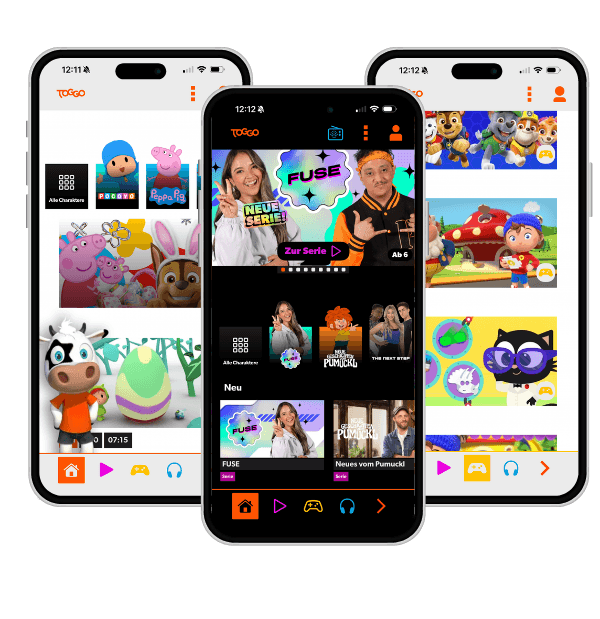
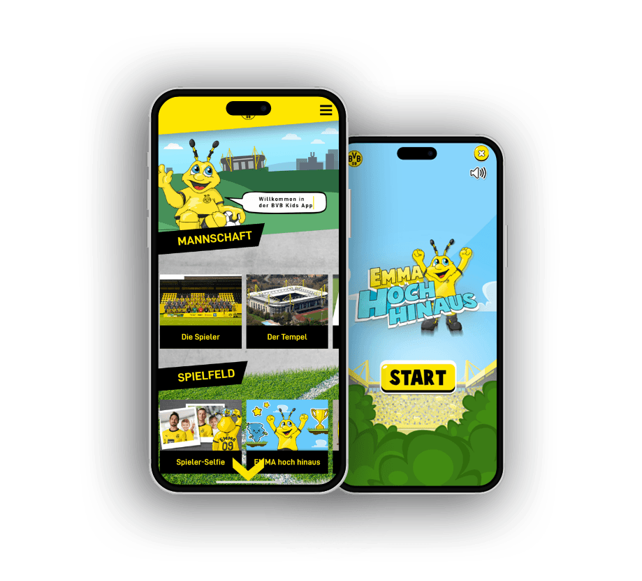

- Your app icon looks unprofessional in the App Store and does not stand out from the competition.
- Your app has good reviews but the conversion from store visit to install is low.
- Your store screenshots show features rather than benefits – potential users do not immediately understand what the app does for them.
Title and Subtitle
The title and subtitle in the App Store and Subtitle in Google Play are the most heavily weighted keyword fields for ASO – and the first text potential users read. We craft titles that include important keywords while clearly communicating what the app does – no keyword stuffing that alienates users.
Screenshots and Video
The majority of store visitors decide whether to read further based on screenshots. We design store screenshots that do not just show features but communicate benefits: with clear headings, focused UI excerpts, and a visual storyline that conveys the app's core promise in a few images.
Description Copy
In Google Play the description text is a direct ASO signal – keywords here influence ranking. In the App Store it is primarily relevant for users. We write descriptions that fulfil keyword requirements while also being genuinely persuasive for real users – not mechanically keyword-stuffed text.
App Icon
The app icon is the only element visible in search results, on the home screen, and in the store overview. It must be recognisable at small sizes, carry the brand personality, and stand out from the competition. We analyse competitors and develop an icon that differentiates.
Conversion Weight per Listing Element
Not every element of your store listing contributes equally to the decision. Icon, first screenshot, and title are seen by almost all visitors – the rest only by those who scroll further.
- App IconFirst impression, also visible in search results
- Screenshots 1–3Above the fold, drives the majority of installs
- Title (with keywords)Ranking and readability at the same time
- Subtitle / Short descriptionVisible without expanding, reinforces the value proposition
- Long descriptionOnly seen by users with strong purchase intent
- Ratings & reviewsTrust signal, not directly controllable
Relative Weighting
Values represent relative conversion relevance, not measured outcomes.
From Store Visit to Installation
A store listing must clear several decision thresholds. Each stage filters out visitors – optimisation work targets exactly the points where the largest drop-off occurs.
Search result / store impression
User sees icon and title in the results list – the first filter deciding whether they click at all.
Listing page opened
Icon, first screenshots, and short text determine further interest within seconds.
Scrolling / preview video
Only a fraction of visitors read the full description or view all screenshots.
"Get" / install tap
The final step – triggered by convincing value, credible reviews, and clear pricing.
Stage width shows relative visitor volume, not absolute numbers.
What matters for App Store Listing
A store listing is decided in seconds, and only what is visible without scrolling counts. The icon, the first visible line of text, and the first two to three screenshots carry the whole load. Communicate benefit there instead of a feature list and you win the tap on install. Whatever comes only after scrolling, most visitors never see anyway.
Screenshots must sell, not document. A raw screen capture shows how the app looks but not why it makes the user's life better. We craft the first screenshots as small messages with a clear statement, because the bulk of conversion is decided here, not in the description below.
The title is conversion and ranking at the same time, and the craft lies in exactly that tension. On the App Store title keywords carry more weight, so you want to place relevant terms there without the title degenerating into a keyword-stuffed string nobody taps. Readable and discoverable at once is the goal.
And good listing work is testing work, not a matter of taste. Which icon, which order of screenshots actually converts is answered by an experiment, not an opinion. Google Play offers Store Listing Experiments directly; on the App Store it runs through additional routes. Guess instead of test and you predictably leave installs on the table.
First 3 Screenshots Are Critical
The majority of store visitors see only the first visible screenshots without scrolling. These first screenshots must immediately communicate the core promise of the app.
Title Keywords Weighted Higher
Title keywords are weighted more heavily by App Store algorithms than keywords in the description. A keyword-optimised title that still reads naturally is one of the most effective ASO measures.
Icon Tests Pay Off
A/B tests for app icons can measurably change install rates. Google Play offers Store Listing Experiments; external testing options exist for the App Store. We recommend supporting decisions with data.
First impression in the store
With us you're always one step ahead technologically and tap directly into our extensive app development expertise. We take a close look at your app idea, identify key success factors and create tailor-made applications. Your visions and goals are at the heart of our joint project work.
Expert knowledge in app technologies
React Native, native iOS and Android development: we pick the stack to fit your project, not our preference.
Comprehensive user experience know-how
Intuitive operation and seamless interactions decide ratings and how long users stay in the app.
Proven track record
Published apps in the App Store and Play Store, from MVP to mature platform.
Versatile team
Concept, design, development and backend come together in one team that works without interface friction.
Long-term partnerships
We stay after launch and keep evolving your app with maintenance and updates.


Frequently asked questions
Your question isn't here? Ask us directly
How many screenshots should I use in the store?
The App Store allows up to 10, Google Play up to 8. Use all available slots – more screenshots give you more room to communicate your value propositions. The first three matter most, as many users do not scroll further.
Should I have a preview video in the store?
Yes, if your app has flows that are hard to show in screenshots. Videos increase engagement but can also lower conversion if they are too long or unconvincing. Keep it under 30 seconds, with the first 2 seconds as a hook.
How often should the store listing be reviewed?
At minimum with every major feature launch and at least once per quarter. ASO is not a one-off task – competition, algorithms, and user expectations change.
Last updated on
READY FOR YOUR APP THAT SETS NEW STANDARDS?


Related articles from our blog